Why the Theme You Pick Matters
The theme is how your store feels before a customer reads a single product description. A jewelry buyer expects something hushed and gold-touched. A streetwear buyer expects something sharp and loud. The wrong theme creates a small but real friction — "this doesn't look like the kind of place I buy from" — and the buyer drifts away.
sellX gives you 11 curated themes. Pick one in two clicks. Your brand color is woven through every option, so switching themes never breaks your identity.
See How Each Theme Looks on a Product Page
Themes don't just change the homepage — they cascade through every page a buyer sees: home, product detail, cart, checkout, tracking. Here's the same product through all 11 themes:
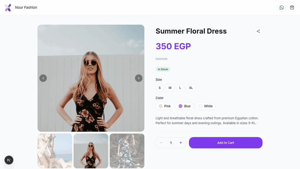
Notice how the price color, button style, card edges, and label feel all shift while the layout stays the same. That's the point — the information architecture is consistent (so buyers always know where the "Add to Cart" button is), but the mood matches what you sell.
The 11 Themes — At a Glance
Light themes
Minimal — Clean and calm. The default. Suitable for any store, especially when you're not sure yet. Generalist sellers, first-time onboarding, mixed catalogs.
Canvas — Pure white with sharp near-black edges and full-saturation brand color. Modern furniture, contemporary art, minimalist fashion, photography, design firms.
Mono — Sharp corners and uppercase tracked labels. Streetwear, menswear, technical apparel, men's grooming.
Editorial — Cream pages with a magazine-boutique feel and small-caps labels. Curated fashion boutiques, lifestyle, premium home goods.
Atelier — Champagne cream with gold hairlines. Fine jewelry, handmade jewelry, watches, leather goods, premium perfume, handbags.
Soft — Pastel-tinted with rounded corners and a soft brand-color glow. Beauty, skincare, baby & mama, clean fragrance, supplements.
Rose — Blush pages with a romantic feel. Modest fashion (abayas, hijabs), perfume, lingerie, florists, feminine handmade.
Dark themes
Sapphire — Deep sapphire blue with platinum hairlines. Engagement rings, pearls, investment jewelry, luxury watches, high-end gemstones.
Hot — Dark pages framed by your brand color. Sneaker resellers, vape, masc fragrance, streetwear drops, hype culture.
Velvet — Deep burgundy with champagne accents. Premium chocolate, red-tone cosmetics, leather, luxury candles, boutique perfumery.
Noir — Warm black with gold accents. Luxury fashion, premium perfume, fine watches, high-end jewelry.
How to Pick Yours in 30 Seconds
Don't overthink it. Answer three questions:
*1. What's the mood a buyer expects when they shop your category?* - Hushed and high-end → Atelier, Sapphire, Noir, Velvet - Sharp and modern → Canvas, Mono - Warm and curated → Editorial, Atelier - Soft and feminine → Soft, Rose - Loud and current → Hot - Calm and universal → Minimal
2. Do dark backgrounds fit your photos? Dark themes (Sapphire, Hot, Velvet, Noir) make jewelry, leather, perfume bottles, and shoes pop. They struggle with light, airy product photography (pastel skincare, baby clothes). If your photos are mostly white-background flatlays, stay in light themes.
3. Are you under-decided? Pick Minimal today. You can change it anytime, in one click — no buyer ever notices because each theme keeps the same page structure.
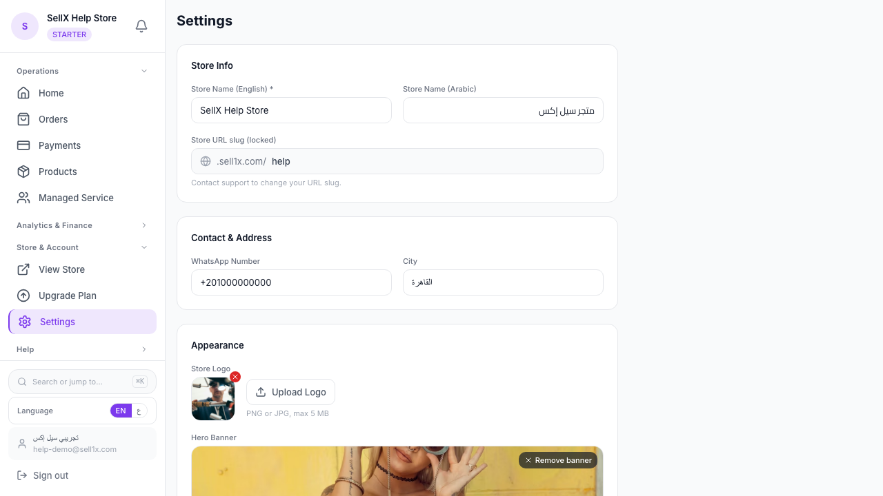
How to Apply a Theme
- From your dashboard, go to Settings
- Scroll to Storefront theme
- Tap any chip — the description updates instantly
- Tap Show preview to see your real store live in an iframe
- Save
That's it. The change is live the moment you save. Your existing products, hero banner, logo, and brand color all stay exactly where they are — only the surface changes.
Your Brand Color Works in Every Theme
A common worry: "If I switch themes, will my brand color get lost?"
No. Every theme is built around your themeColor (set right above the theme picker). It shows up differently depending on the theme — sometimes as the CTA button (Minimal, Mono, Canvas), sometimes as a page tint (Soft), sometimes as a hero rule (Editorial), sometimes as a card-outline glow (Hot). But it's always visible and always yours.
Pick the theme that best matches your category, then tune your brand color to taste. The two work together — they don't fight.
When to Change Themes
You can change at any time, but the most common moments are:
- You started on Minimal to launch fast, and now you've narrowed your niche → upgrade to the theme that matches it
- You're running a seasonal collection (e.g. holiday luxury) → switch to Velvet or Noir for the season, then back
- Customer feedback says the store "feels off" for what you sell → trust them and try a closer fit
Themes are not permanent decisions. They're surface-level. Treat them like changing a profile photo — fast, reversible, and worth getting right.
Common Questions
Will switching themes break my product photos or descriptions? No. Themes only change colors, fonts, corners, and surface treatments. Your products, prices, photos, options, and descriptions are untouched.
Will old orders or customer accounts be affected? No. Themes are visual-only — they don't touch order data, customer info, payments, or delivery settings.
Can I customize a theme beyond what's shown? Not directly — that's the point. Themes are curated so every option is balanced and looks polished out of the box. If you want a unique color, change your brand color; if you want a unique vibe, switch themes.
Which theme do most sellers pick? Minimal is the safest default and works for any catalog. Soft is most popular for beauty/wellness. Atelier and Sapphire dominate jewelry. Mono and Hot dominate menswear and streetwear.
The Bottom Line
A theme isn't decoration. It's the first signal a buyer reads about your brand — before pricing, before reviews, before product details. Pick the one that matches what you sell, and you'll feel the difference in conversion.
If you're not sure, start with Minimal. Browse your store. Then come back and try the one closest to your niche. The whole loop takes a minute.